Frontier Flight Attendant Data Dashboard

Project Overview
The Inflight Experience department of Frontier Airlines is responsible for managing the Flight Attendants of the airline. They brought me onto their team looking to update their communications to be more effective and aligned with the Frontier brand.
Role: Designer of Communication and Branding
Team: As the department's sole intern and designer, I reported directly to the V.P. of Inflight Experience.
Timeline: 5 months
The Challenge: Frontier Flight Attendants weren't reading their company emails — causing costly operational errors. Frontier needed a way to drive consistent inbox engagement before more mistakes occurred.
The Users: Frontier Flight Attendants
Age: 20-60+
Flight Attendants make up over 50% of the Frontier Airlines work force.
Flight Attendants are primarily self-managing. They can go months without interacting with their supervisors, and they build their own schedules; making them an extremely self-driven work force.
Research
Methods: Community observation · Contextual inquiry · User interviews
300+ hours of immersion across 20 flights · 5 bases · 4 crew rooms · Recurrent & initial training · 10+ crew interviews (FAs, new hires, reserve crews, Inflight Leadership)

Synthesis
Core Pain Points: Lack of transparency · Fear of Inflight Leadership · Lack of recognition
Key Themes:
People & travel — FAs are people-oriented and travel-motivated; flight benefits are the #1 draw to the role.
Distrust of leadership — FAs view supervisors as enforcers, not resources, and avoid bringing issues to them.
Feeling undervalued — A lack of recognition leaves FAs unmotivated to go above and beyond.
300+ hours of research distilled into a strategic brief with proposed solutions — presented directly to the COO and VPs.

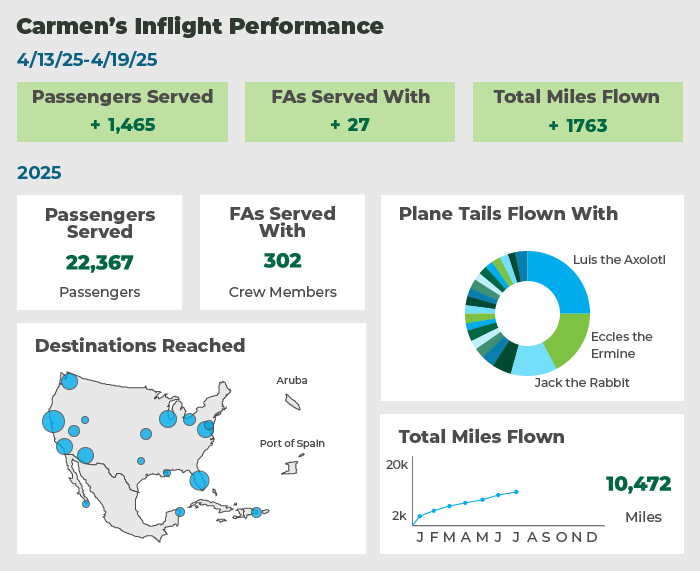
Weekly Stats Email Before
The existing weekly email contained attendance performance data — useful for Inflight Leadership, but largely meaningless to the Flight Attendants receiving it. My research confirmed what the open rates already suggested: most of them weren't reading it.
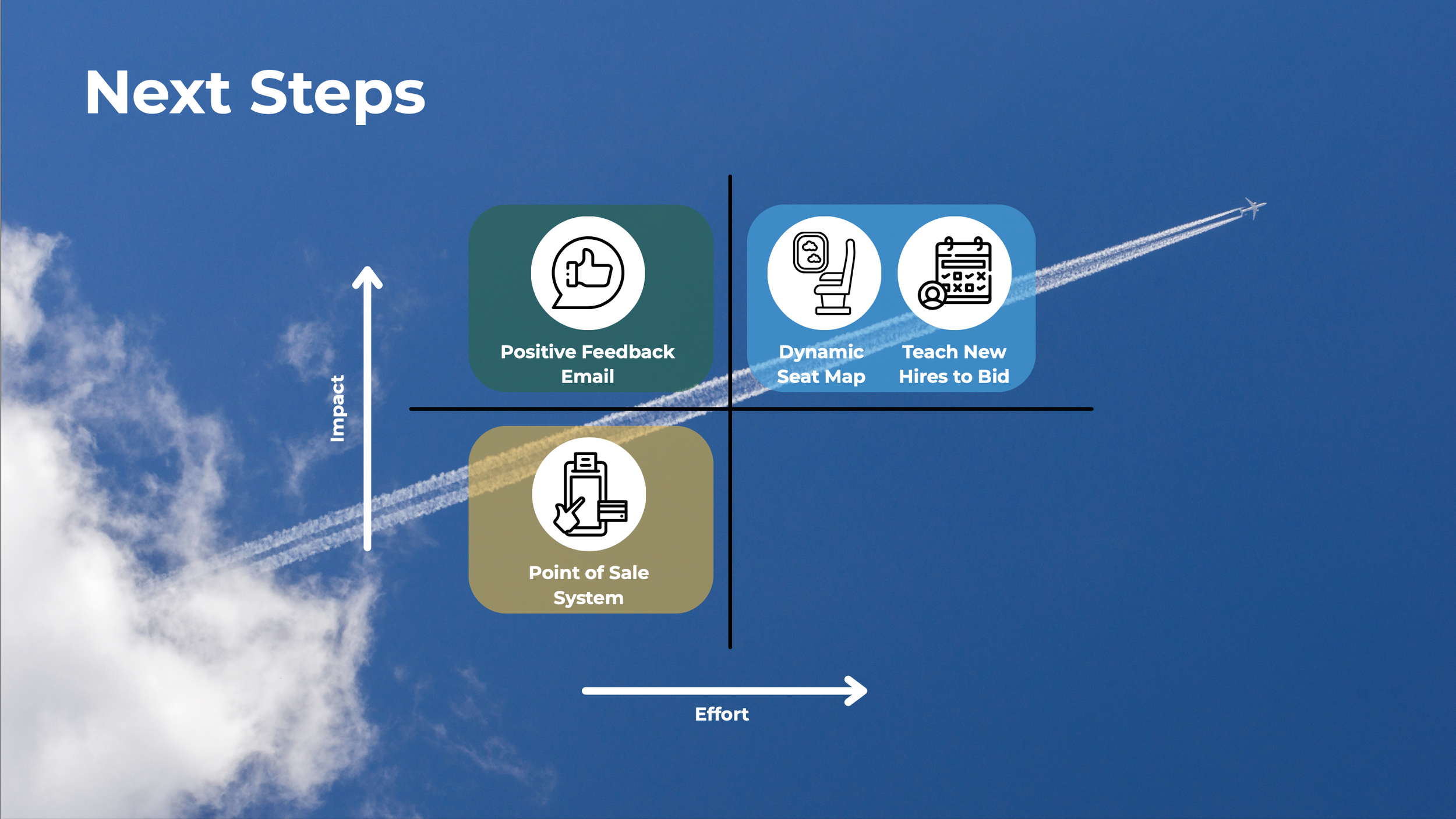
Design Goals
Address the root pain points — lack of recognition and lack of transparency — by giving Flight Attendants data that felt personally valuable, not punitive.
Redesign the existing weekly attendance performance email into a data dashboard, leveraging the system already in place while transforming the interface and data categories.
Make the dashboard compelling enough that Flight Attendants would actually look forward to opening their company email each week.
Shift the feeling from "cog in a machine" to empowered, informed professional.
Challenges
Challenge: The preexisting system for generating and sending the data was far more limiting than I anticipated — ruling out maps and complex vector graphics I had included in early mockups.
Solution: I got creative with simpler visuals that could be generated quickly on the back end, going through many iterations until I landed on something that maintained readability without breaking the system. There was no quick fix, but the trial and error was worth it.
Pictured: Early iteration with more complex vector based graphics.
Final Design
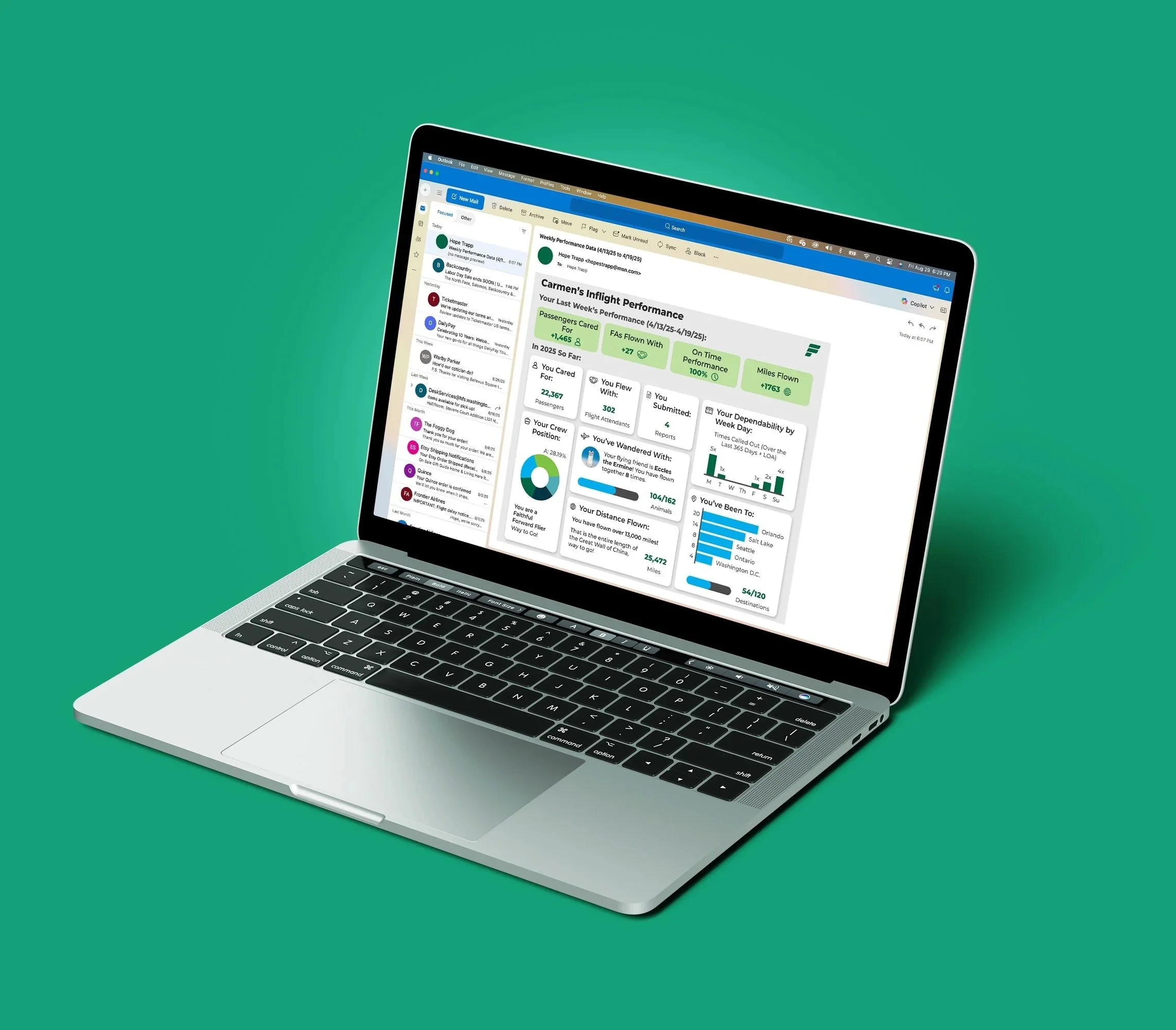
Drawing directly from my research (FAs are people-oriented, travel-motivated, and self-driven), I recentered the data around their personal performance: where they've flown and the people they've served. The result transformed the weekly email from a disciplinary tool into something FAs could use to set and track their own career goals.
I partnered with the department's data specialist to ensure the designs could be generated and distributed through existing company systems, then presented to the head of Inflight and the V.P. of Communications for feedback. After several rounds of revisions, they felt confident enough to distribute it to Flight Attendants.
Conclusion
Five months immersed in the world of Frontier Flight Attendants, flying with them, training with them, sitting in their crew rooms, gave me a level of understanding of my users that I believe every designer should strive for. By the time I sat down to design, I wasn't guessing at what would resonate with them. I knew.
When the dashboard launched and the positive feedback came in, it wasn't just a validation of the design — it was a validation of every hour spent earning their trust and advocating for them. Seeing Flight Attendants feel empowered by their own data was exactly what I had set out to achieve. I walked away from this project incredibly proud, and I continue to carry a deep compassion for every Flight Attendant I met along the way.